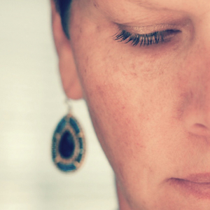
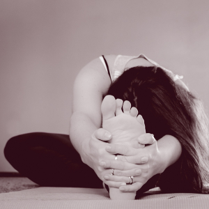
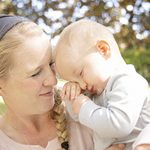
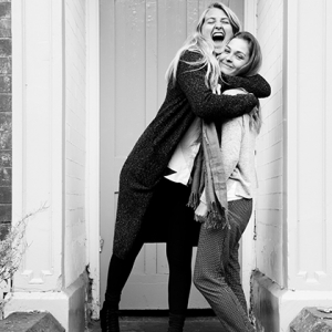
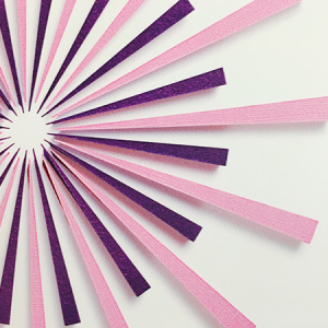
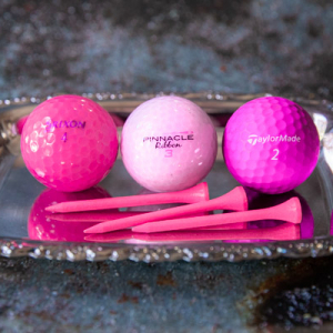
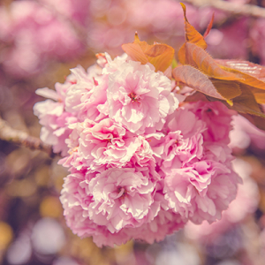
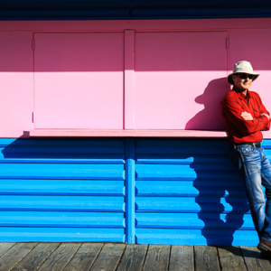
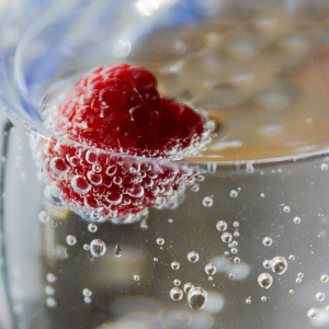
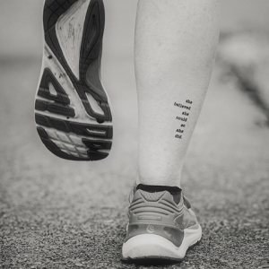
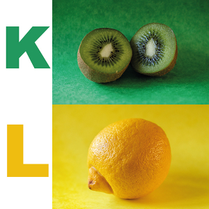
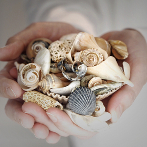
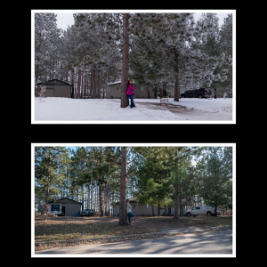
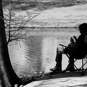
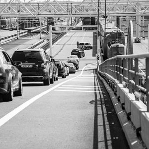
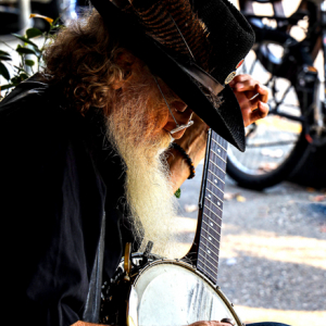
The easiest way to create contrast is by creating changes in the tones or colors in our images. Higher contrast will give a different feel than lower contrast (think of Low-Key week in March). By using the most contrasting, or complementary colors (like red and green which are opposite each other on the color wheel) you'll capture a beautifully contrasted photo. On the other hand, if you want to use analogous colors (colors that are next to each other on the color wheel), you can create a lower contrasted image. By using complementary or analogous colors, you’ll create juxtaposition - which is placing two things together to show contrast or similarities. Another idea is using tonal contrast which is especially seen in B&W photos, or warm or cold colors. Contrast can be created by using different shade/tint, using different textures, higher depth of field to blur your background, old/new, big/small, natural/artificial. When you are taking photos this week, think about the mood you'd like to convey and play with diverse types of contrast that will make that mood stand out.

Day 135
Picture More
Contrast
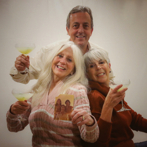
Bubbly
Danette