We asked the community for a change to actually edit our photos, follows is how they interpreted the creative teams photos.
Danette
(click on the images to see bigger versions)
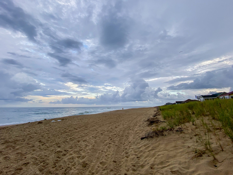
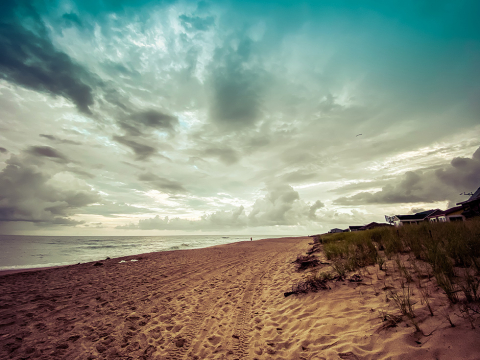
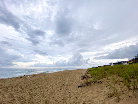
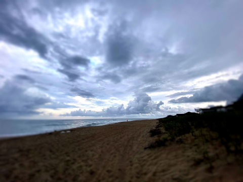
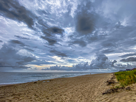
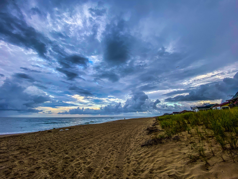
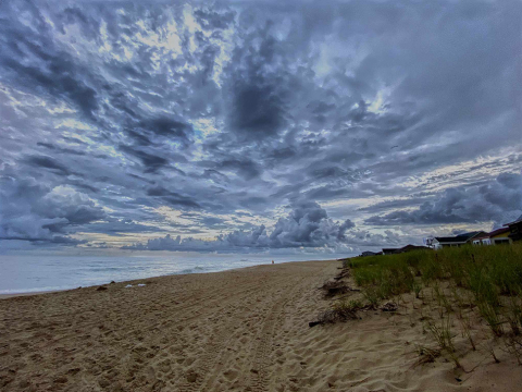
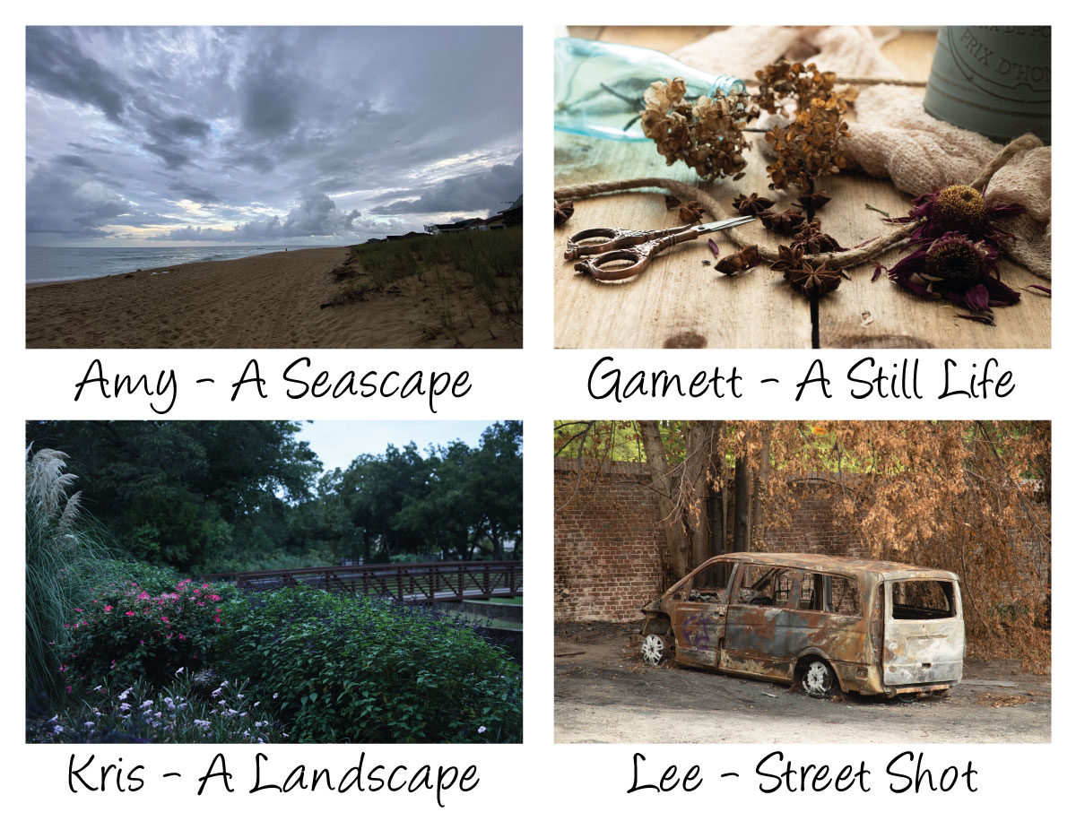
Amy – A Seascape
I edited this in Lightroom. I brought down highlights, whites and blacks. Then I upped the exposure, contrast, and shadows a bit. I added a bit of vibrance in the color and also added a bit of sharpening and noise reduction as well.
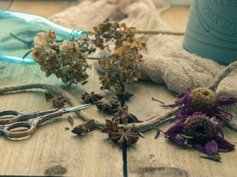
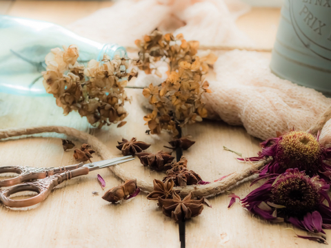
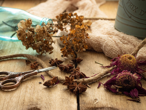
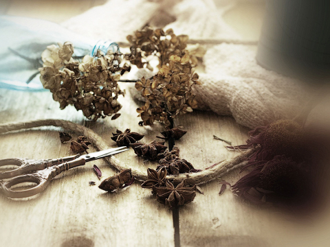
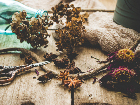
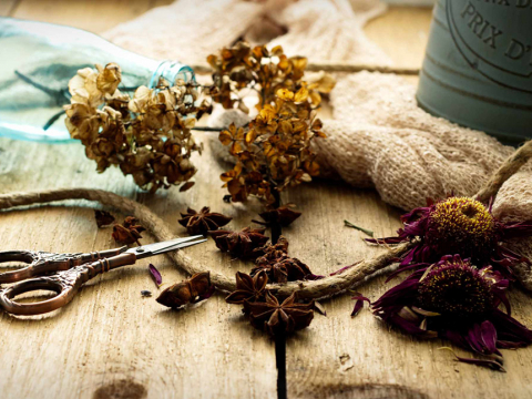
Garnett – A Still Life
Edited in Lightroom. I upped exposure, contrast, and shadows. I brought down highlights, and blacks a bit. Added a small bit of vibrance and just a very small bit of saturation. I also upped a bit of sharpening and noise reduction.
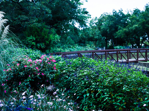
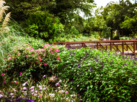
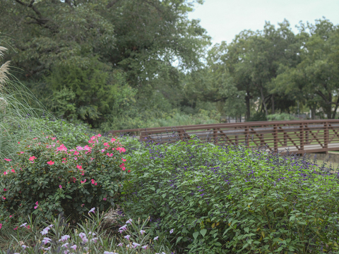
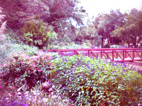
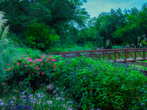
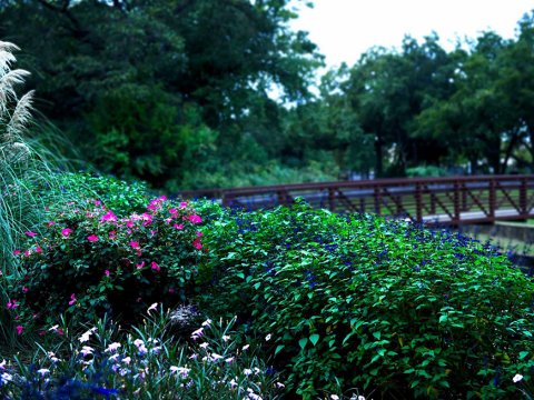
Kris – A Landscape
Edited in Lightroom – I added exposure, contrast, and shadows. I brought down whites and blacks. I reduced green saturation.
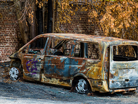
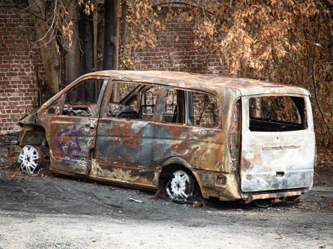
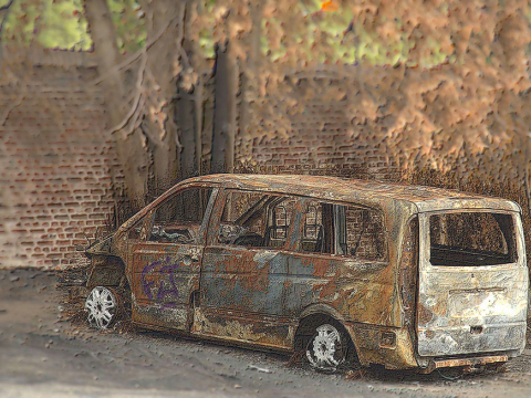
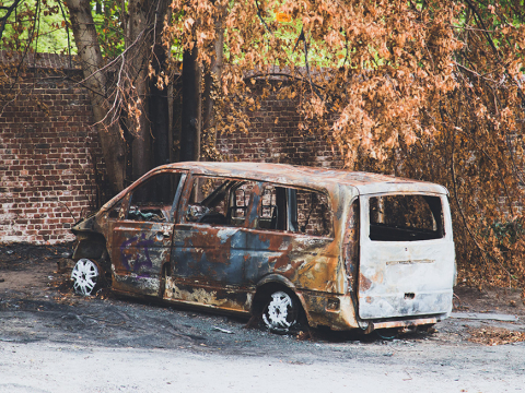
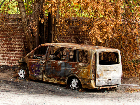
Lee – Street Shot
Edited in Lightroom – I brought up contrast quite a bit and shadows a little. I reduced highlights, whites, and blacks. I moved tint and vibrance up just a bit.
All of these were excellent photos! Thank you for letting me play with them!
Debra
(click on the images to see bigger versions)
I used an On1 Photo preset for the Amy's Seascape, Garnett's Still Life and Kris' Landscape.
For Lee's Street Shot, I cropped, increased saturation, contrast and detail and burned the back end and wheels.
Diane
(click on the images to see bigger versions)
I realized through this process that I edit most photos in the same manner!
Edits made:
Amy’s photo:
• Cropped photo just a bit • Increased texture • Increased temperature • Used a gradient filter and increased highlights to emphasize the sky and clouds • Increased shadows to get definition in the houses • Increased saturation in the greens to make the grass pop a bit more
Garnett’s photo:
• Cropped in just a little • Straightened photo so that middle line was more vertical • Used a gradient filter to bring down exposure on left hand side of photo • Added texture • Reduced clarity just a bit • Increased temperature to warm it up a bit, increased vibrance and saturation • Added a vignette
Kris’s photo:
• Cropped a little • Increased exposure, highlights and whites • Increased temperature to add a little warmth • Increased vibrance • Increased texture • Added Soft Mist preset (standard Lightroom preset)
Lee’s photo:
• Cropped photo just a bit • Increased highlights • Reduced shadows • Increased both texture and clarity • Increased vibrance • Increased temperature • Added a vignette
Joy
(click on the images to see bigger versions)
Photo Editing Process using Corel PaintShop Pro
Amy’s Seascape Photo
Applied fade correction - Increased brightness and contrast - Depth of field - Sharpened
Garnett’s Still-Life
Applied fade correction - Increased fill light/clarity - Increased vibrancy - Straightened - Used “Instant Effects” Retro - Retro soft - Sharpened, and sharpened more for more texture
Kris’s Landscape
Straightened - Increased fill light/clarity - Used “Instant Effects” Retro - Retro Magenta, then Retro Surreal - Added a slight blur Going for a “Fairies live here” kind of look
Lee’s Street
Cropped - Increased contrast - Decreased brightness - Depth of field with low blur – circled van - Sharpened - Used “Instant Effects” Artistic - Pencil Light Colour - Increased vibrancy
Lori
(click on the images to see bigger versions)
Amy’s Photo:
- Cropped and straightened
- Put the horizon on the horizontal third, as well as the person in the distance on the vertical third
- Applied an HDR preset to really bring out the drama of the clouds
- Adjusted highlights, shadows, exposure, clarity, texture, and contrast
- Applied Sky Bad Weather adjustment brush to further add drama to sky
- Applied adjustment brush to add extra saturation to grass
- Applied adjustment brushes to add more attention to sand
- Applied sharpening mask to sharpen only the edges
Garnett’s Photo:
- Cropped and straightened
- Changed vertical and horizontal perspective slightly
- Adjusted highlights, shadows, blacks, clarity, texture, and contrast
- Applied a preset from 2 Lil’ Owls Deliciously Matte collection
- Applied adjustment brush to add focal point attention to front two star anise,
- the the two flowers on the right, and the nearest edge of the scissors
- Applied noise reduction
- Applied sharpening mask to sharpen only the edges
Lyly
(click on the images to see bigger versions)
Lyly used PS Express and presets to edit.
Yvonne
(click on the images to see bigger versions)
Amy’s Seascape.
- Fractionally straightened the horizon and lightly cropped. Cloned out ariel on the end house.
- Selected sky and toned down highlights and upped the shadows, tweaked the colour balance.
- Selecting ground/sea, tweaked exposure, black point, clarity and tone mapping. Upped the vibrance.
Garnett’s Still Life
- Light cropping to remove end of board.
- Selected flowers to increase brightness and vibrance.
- A whole photo light curves adjustment and contrast.
Kris’s Landscape
- I started with a curves adjustment, then selected foreground from background so I could adjust separately. HSL adjustment and brightness/contrast plus vibrance.
- Background added a light gaussian blur.
Lee’s Street
- Cropped image to lose some foreground.
- Selected van and altered contest brightness/contrast separately to background.
- Upped vibrance and a little saturation to warm background tones.
- On van adjusted shadows/highlights and vibrance to pop image
- (Saved just the van as a png to use with another image)
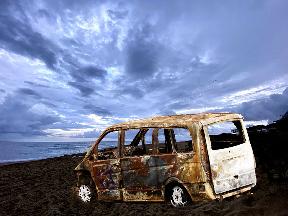
And just for fun Yvonne did a combined edit too!
Amy/Lee mix up
Altered the brightness/contrast on Amy’s image and placed Lee’s cut out car on top, adjusting size and angle. Then cloned sand around the wheels to blend in more with the beach.
I would have toned down car more, maybe by doing white balance, but it was very late at night when I was doing this and I gave out…
A big thank you for all those that played along. Thank you!
