We are all busy people even in time of a pandemic and the summer has gotten away from us, so, the August blog is just a quick go at editing some photos from the community. If you do want more information on exactly how the edits were done do contact us.
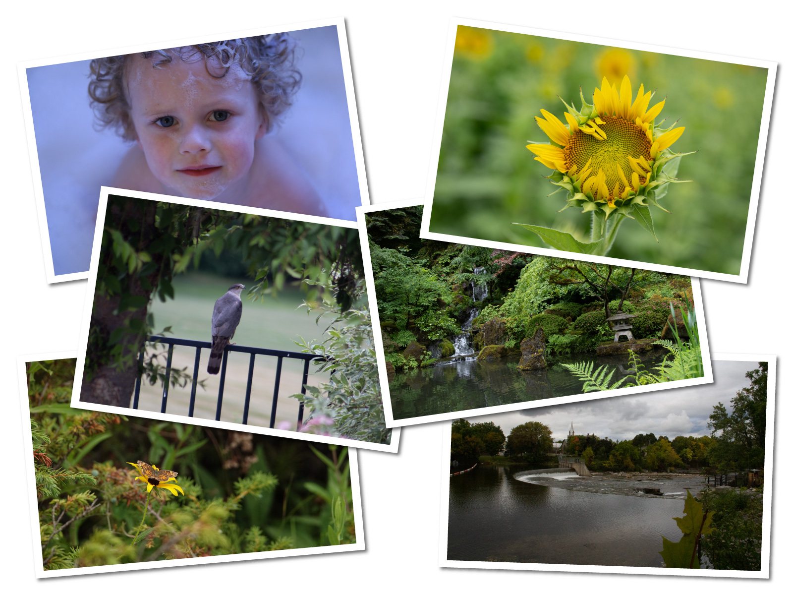
Amy's edits were all carried out in Adobe Photoshop Express
Garnett edited in Lightroom and Photoshop,
Kris did all of her edits on her iPad using the Apple resident photo editor and the Hipstamatic app. Hipstamatic has been around for a good while. It has lots of in-app filters for purchase.
Lee did all her edits in Lightroom.
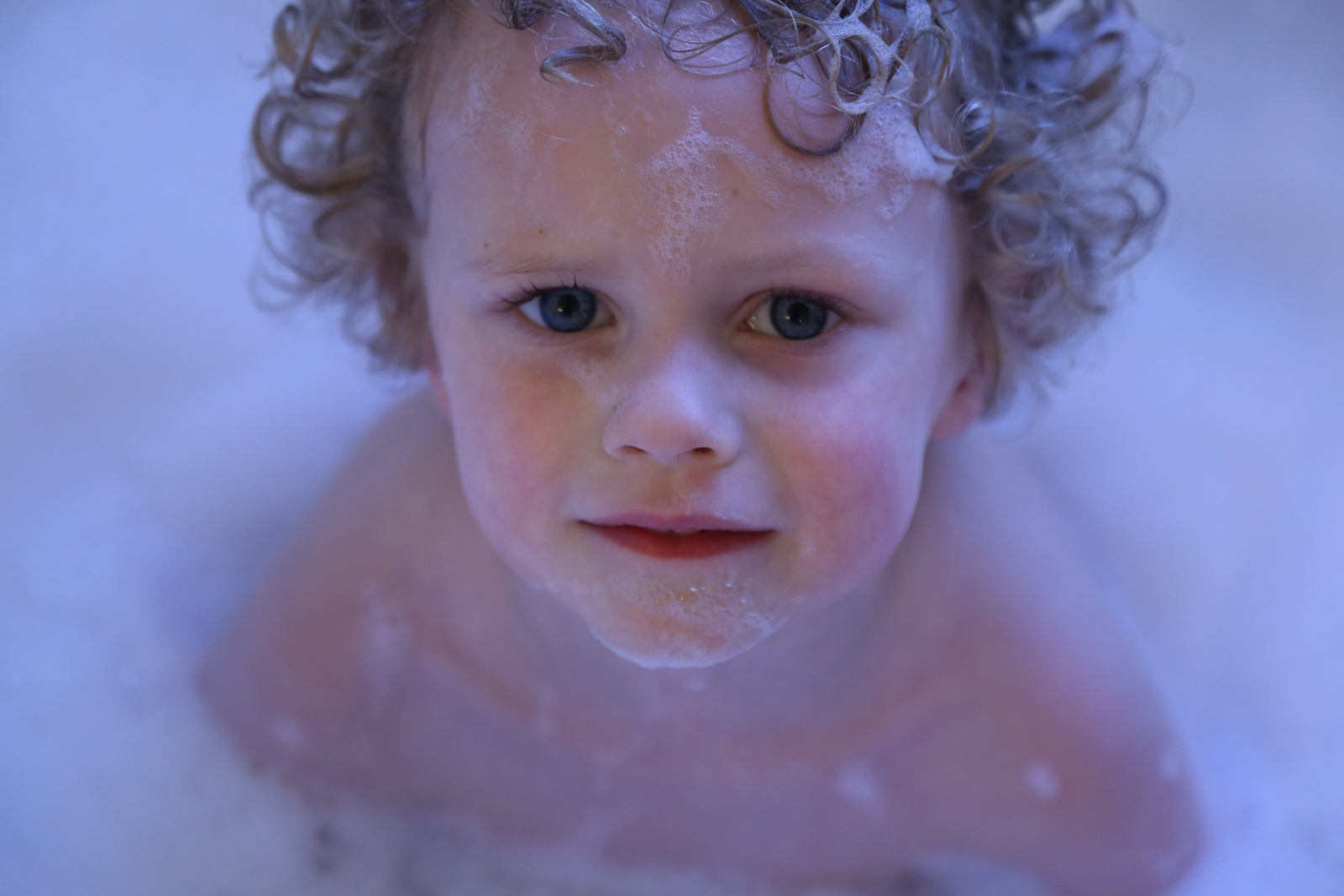
Lee Ann's Photo

Amy's Edit
Filter: Charm 9, Shadows +45, Blacks -15, Temperature +5
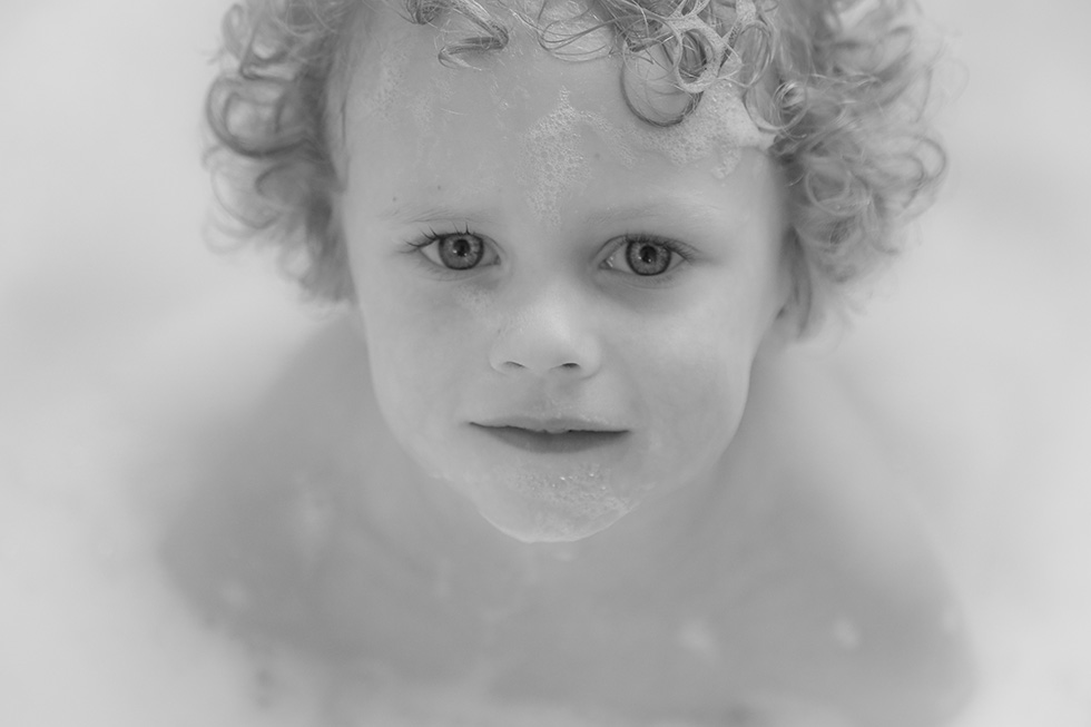
Garnett's Edit
Lightroom
Used my own Preset (B&W Soft Portrait) that I created for portraits
Sharpened eyes and enhanced catchlights
Added light vignette

Kris' Edit
Brightened and warmed this photo using the Apple editor

Lee's Edit
I firstly changed the white balance, so not so blue and more natural colour
I added a Preset called CoffeeShop Burgundy Wine Matte
Added a brush stroke to the eyes to highlight them a bit more, and upped the clarity.

Kay's Photo
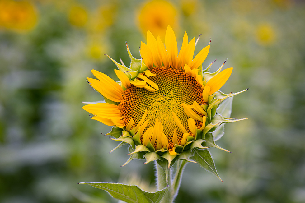
Amy's Edit
Filter: Dappled, Dehaze +15, Clarity +15, Tint +50
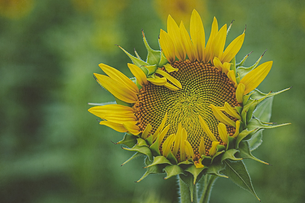
Garnett's Edit
Lightroom
Cropped in close on sunflower
Used sliders to decrease saturation and increase vibrance and to increase texture
Added Matte and Vignette
PhotoShop
High Pass Filter for sharpening
Added Texture from Luxe Bohemian Collection
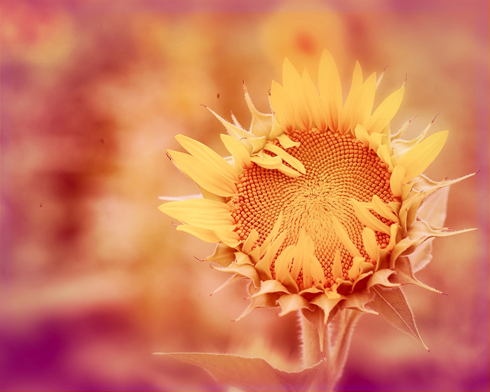
Kris' Edit
I am a big fan of sunflowers. They always make me think bright, cheerful, happy.
I cropped the photo to move the subject closer to the right third of the frame and changed the aspect ratio to 4:5.
I then used Hipstamatic’s Alfred Infrared film and Chivas lens to alter the background color to reflect the happiness that I feel when seeing sunflowers.
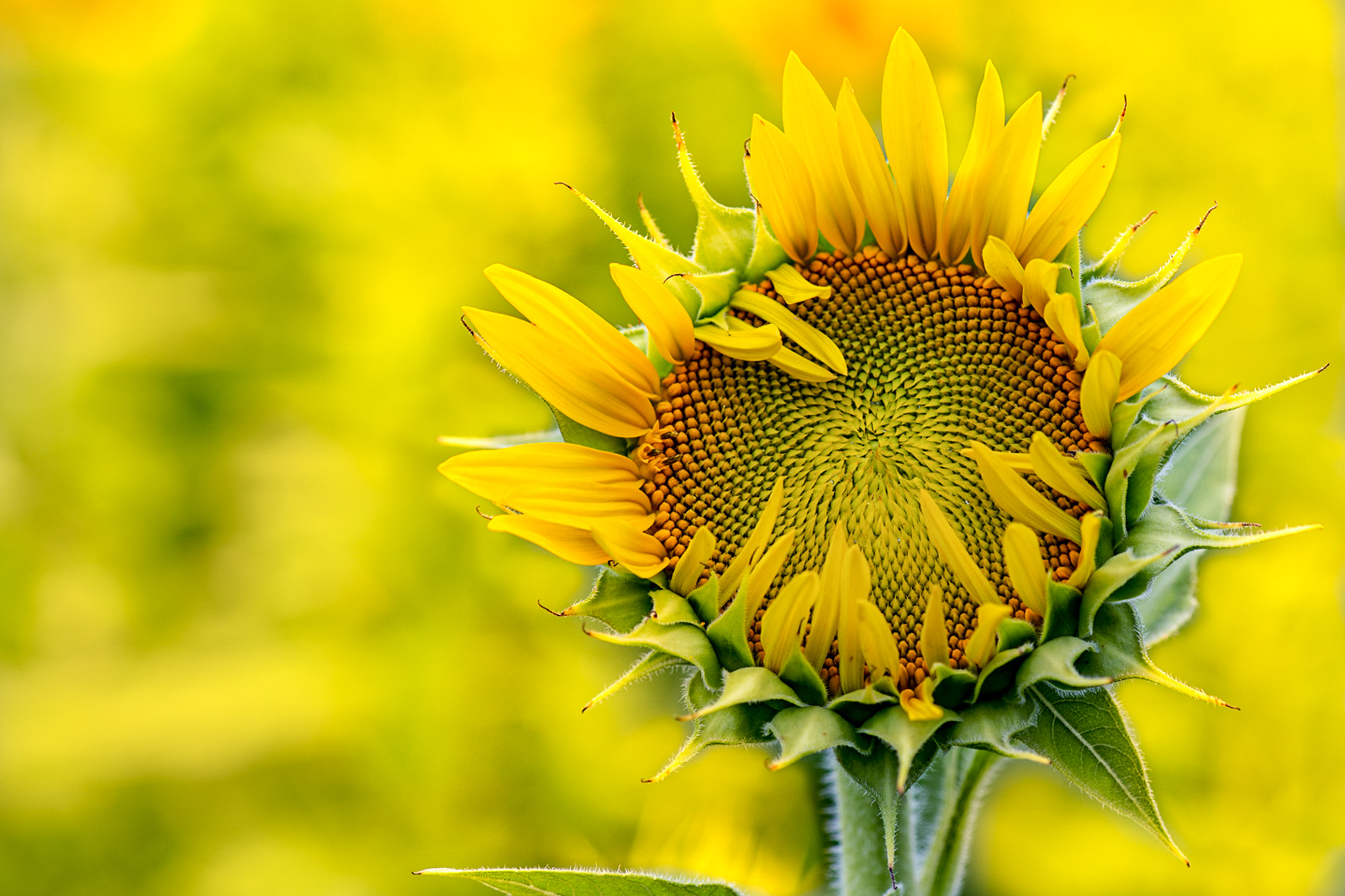
Lee's Edit
Cropped, Lowered the tint, highlights, blacks
Upped the shadows, whites, texture, clarity, dehaze and vibrance.
Added a mask to the background lowering the contrast, upping the saturation and added a yellow overlay.
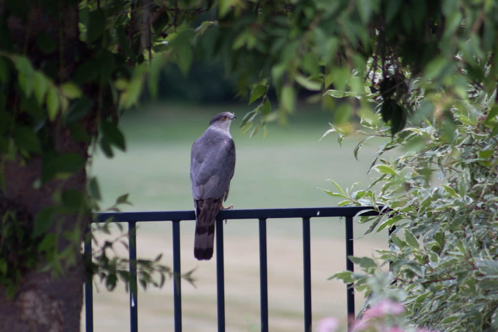
Lori's Photo
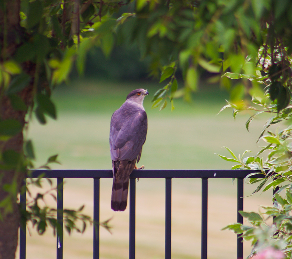
Amy's Edit
Filter: Summer, Vibrance + 15, Dehaze +10, Fade +15, Shadows +40, Whites+25, Blacks -15.
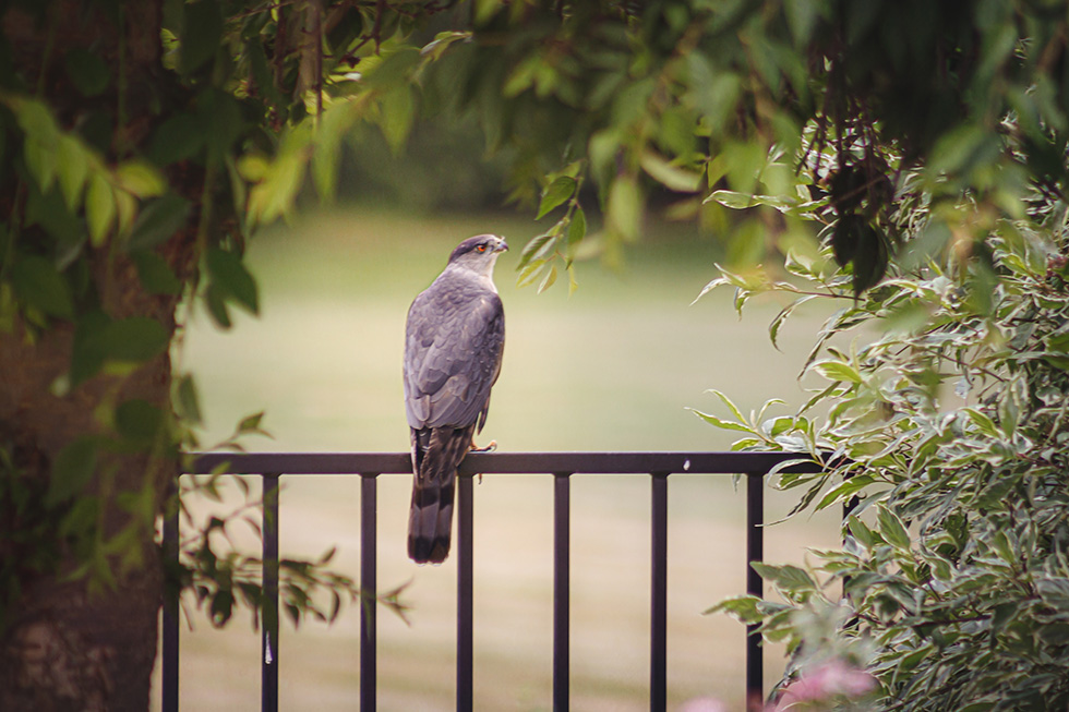
Garnett's Edit
Lightroom
Straightened
Added texture and clarity
Added some spot highlighting on the hawk
Photoshop
Used High Pass Filter to sharpen
Added a texture from 2 Lil Owls to camouflage the hawk being slightly out of focus
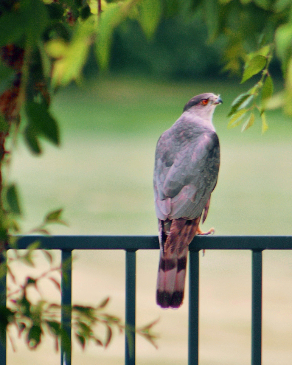
Kris' Edit
I straightened and cropped the photo.
I then increased the contrast, black point, and vibrancy.
I also warmed the photo.
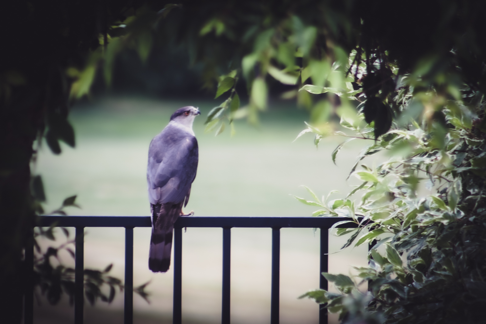
Lee's Edit
Straightened and cropped so bird was on the third
Added Preset Kim Klassen, Onair Lemon
Lowered the Textures, blacks, and Highlights
Added black Vignette to frame the shot
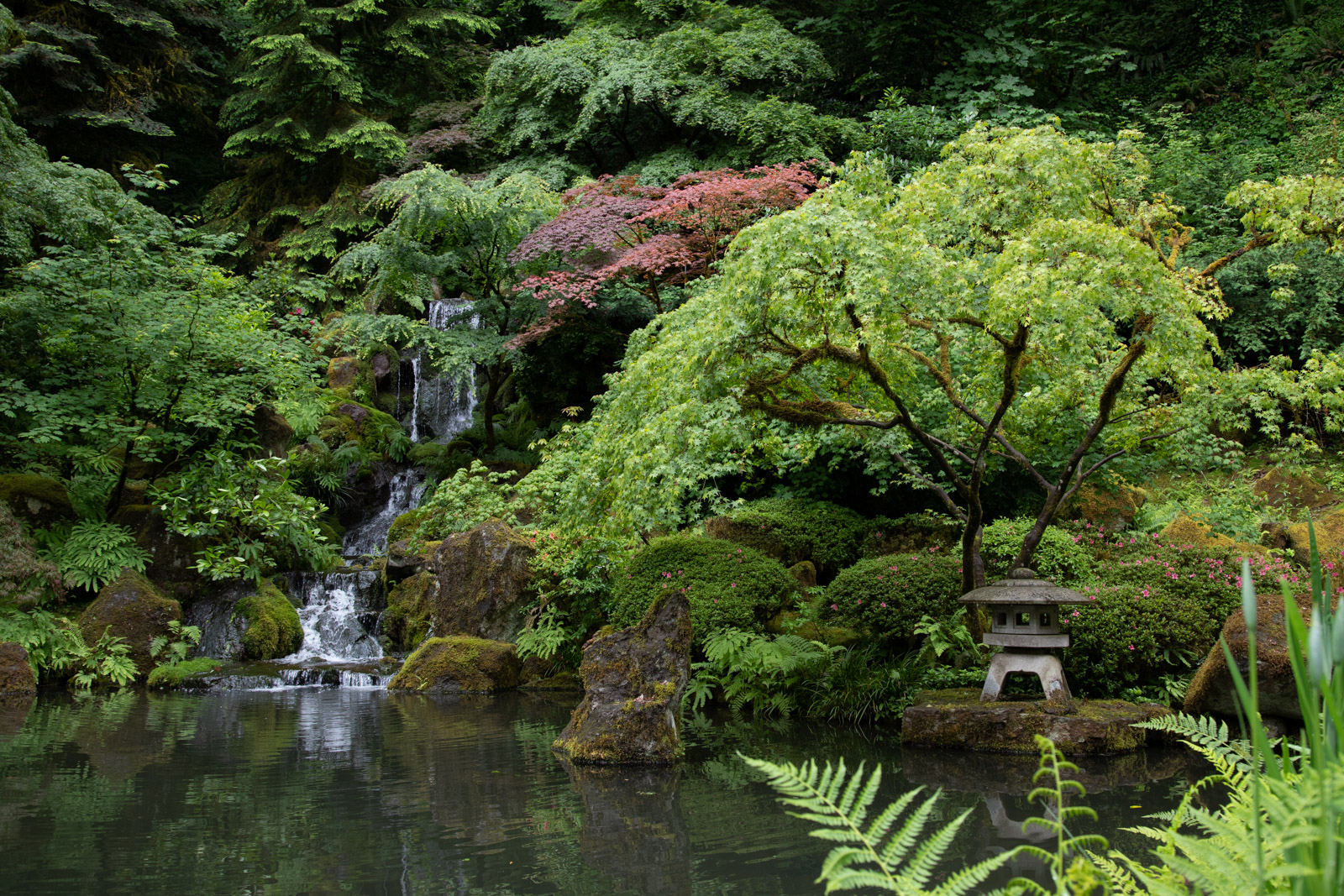
Debra's Photo
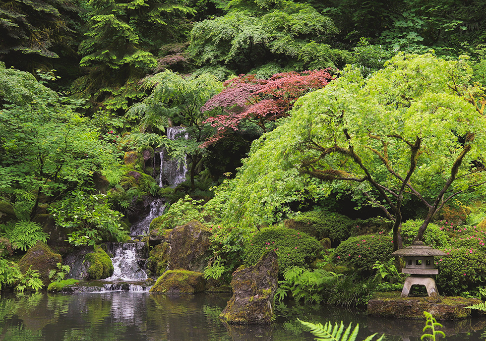
Amy's Edit
Filter: Warm 3, Dehaze +10, Contrast +10, Highlights -20, Tint +15, Crop
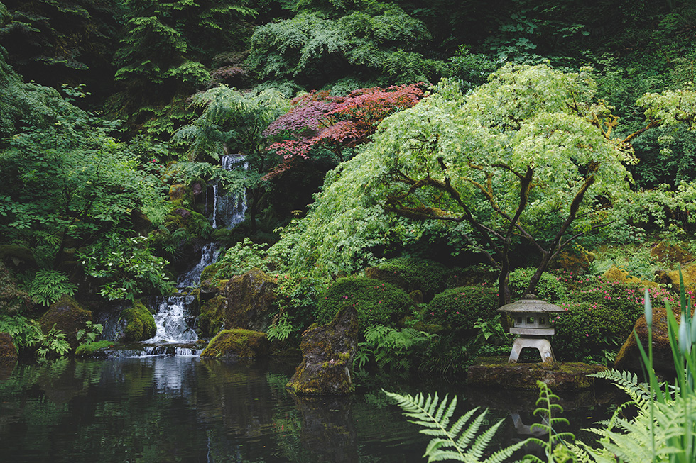
Garnett's Edit
Lightroom
Used sliders to desaturate and cool
Used brush to add more color to red tree
Used brush to lighten the cement statue
Added a slight matte finish
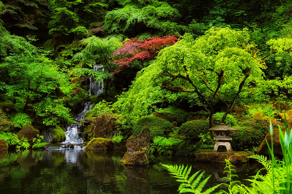
Kris' Edit
I increased the saturation, vibrancy, and black point in this image.
My intent was to help the waterfall and red pop.
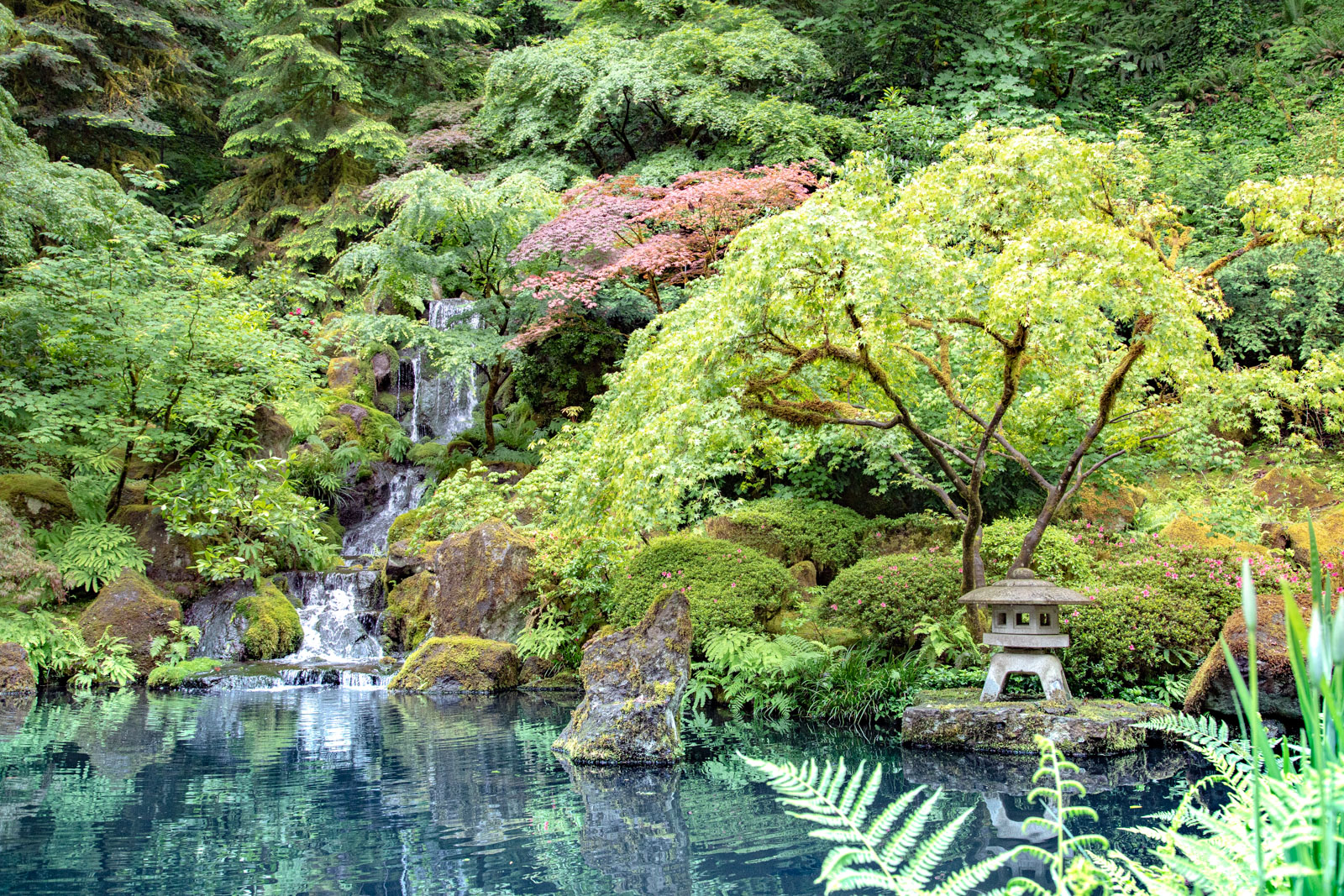
Lee's Edit
Upped the exposure, Shadows, Whites, Blacks, Dehaze and Vibrance
Lowered the Contrast and Contrast.
Added a Graduated Filter to the water, to show the reflections better and the water to be blue.
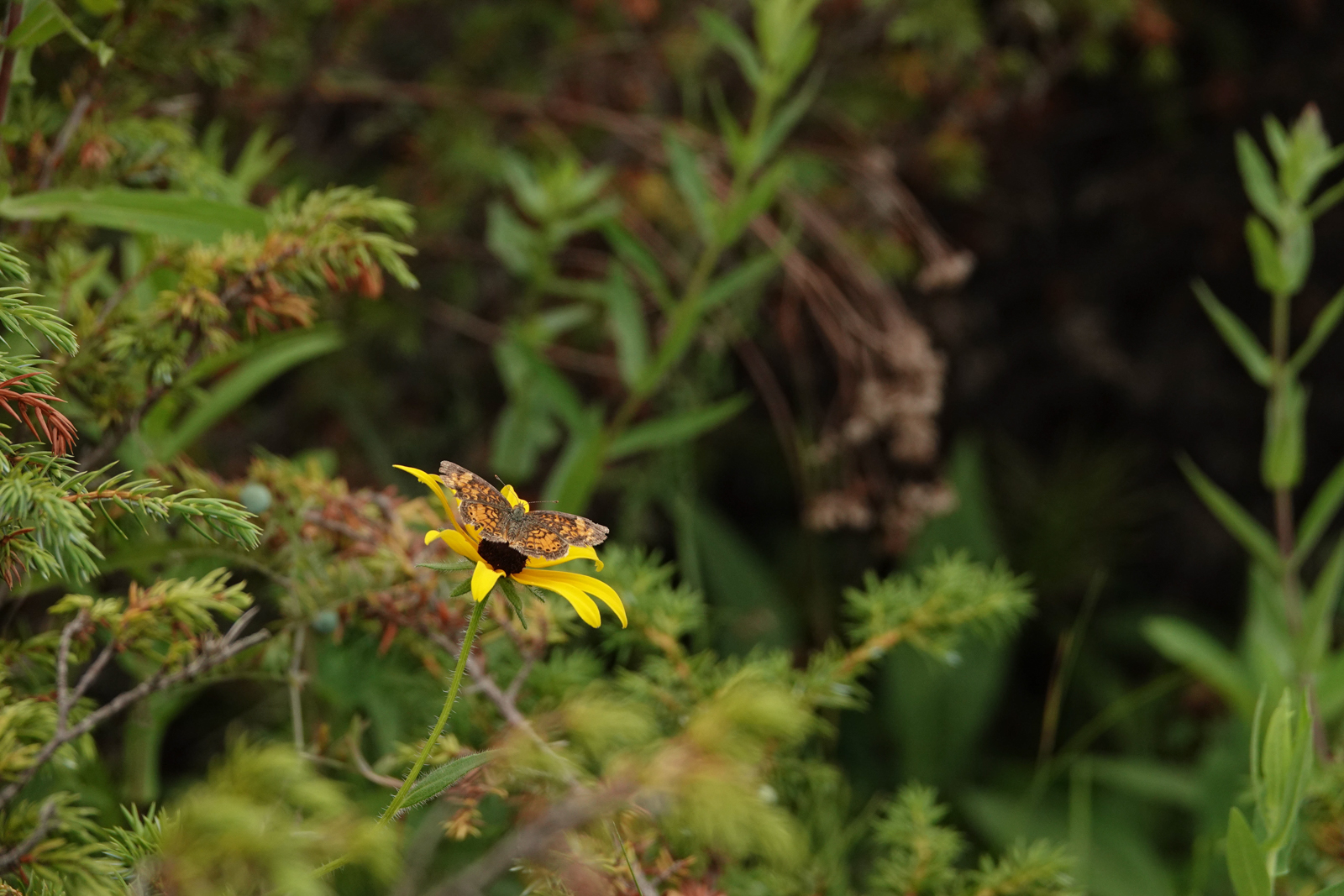
Julie's Photo
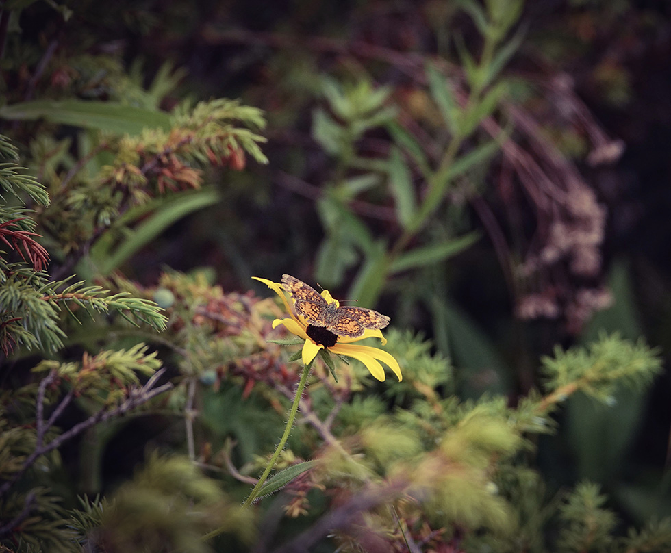
Amy's Edit
Filter: Autumn, Tint +10, Dehaze +20, Fade +10, Crop
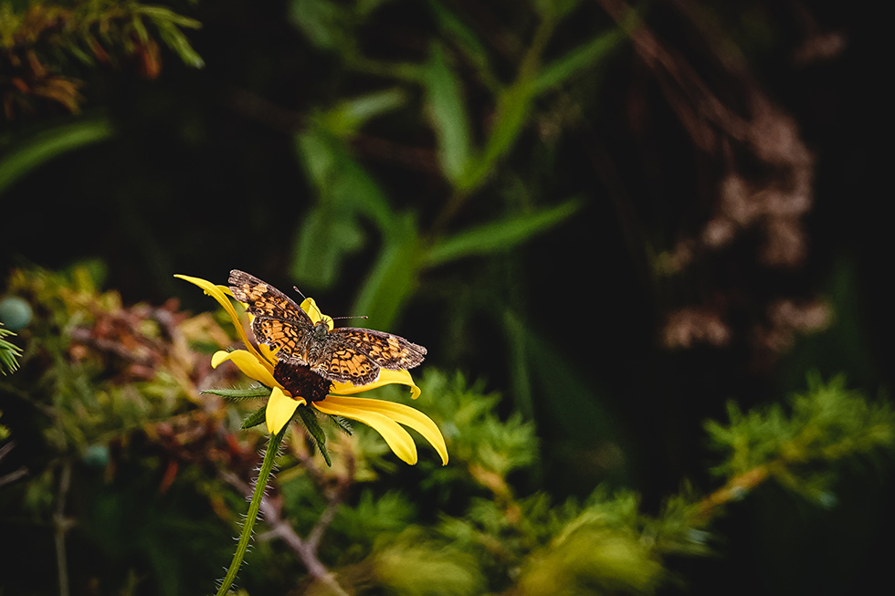
Garnett's Edit
Lightroom
Cropped in closer to see the butterfly
Used my own preset that I call “Morning Light”
Decreased Saturation slightly
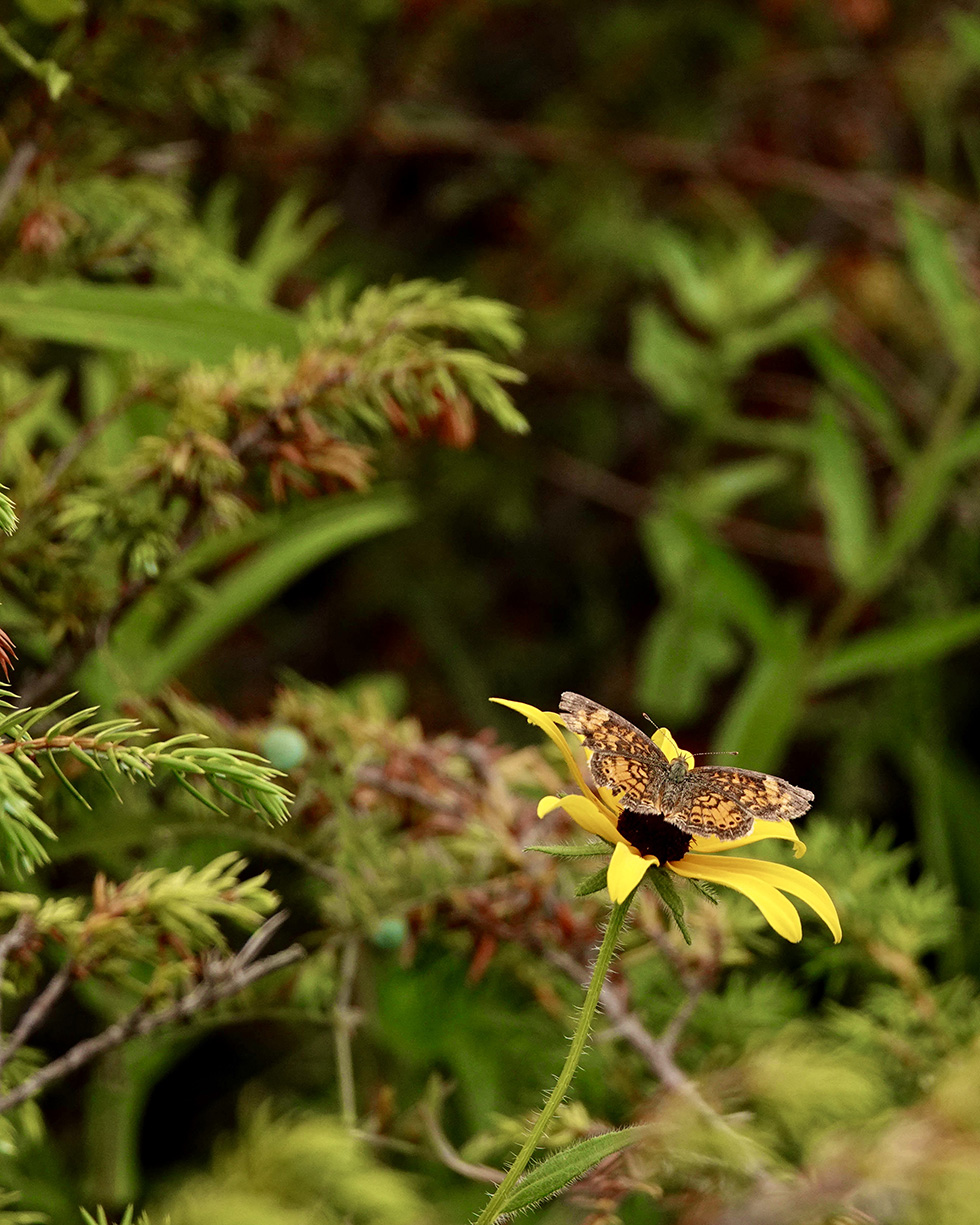
Kris' Edit
I cropped this photo hoping to make the butterfly “bigger” in the frame.
Then I increased contrast, vibrancy, and warmed the image a bit.
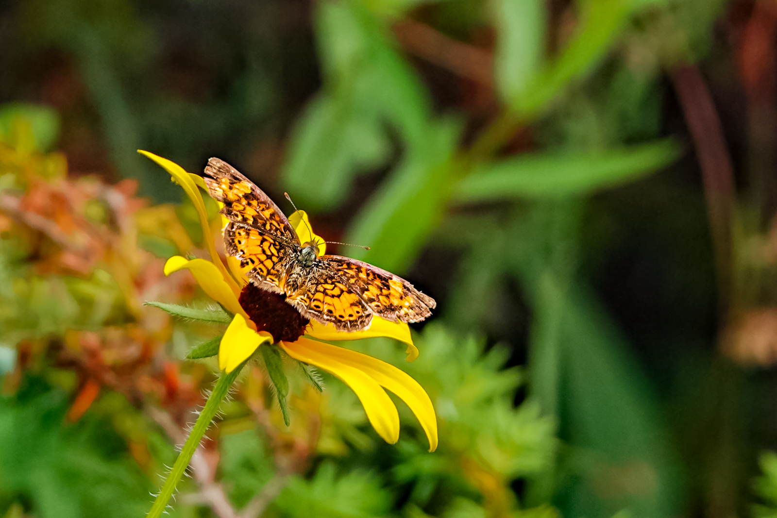
Lee's Edit
Cropped and slightly rotated to make the butterfly stand out
Upped the exposure, contrast, shadows, whites, dehaze and vibrance
Lowered the highlights
Used the adjustment brush on the butterfly, to up the contrast, texture, clarity and dehaze.
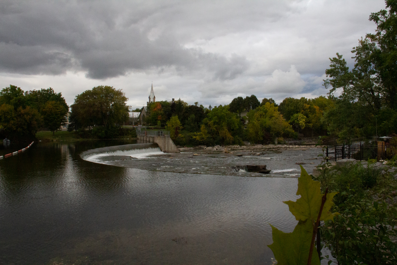
Joy's Photo
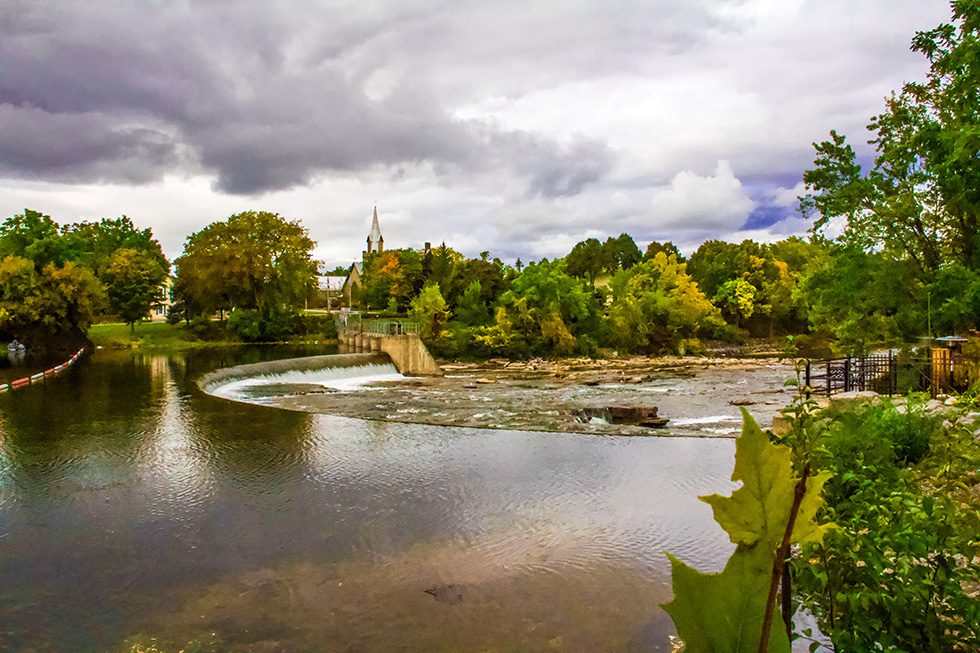
Amy's Edit
Filter: HDR20 Shadow +15, Blacks -10, Vibrance +15.
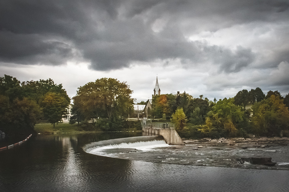
Garnett's Edit
Lightroom
Cropped in so that foreground leaves weren’t in photo
Adjusted light, texture, haze and vibrance
Added a dark vignette
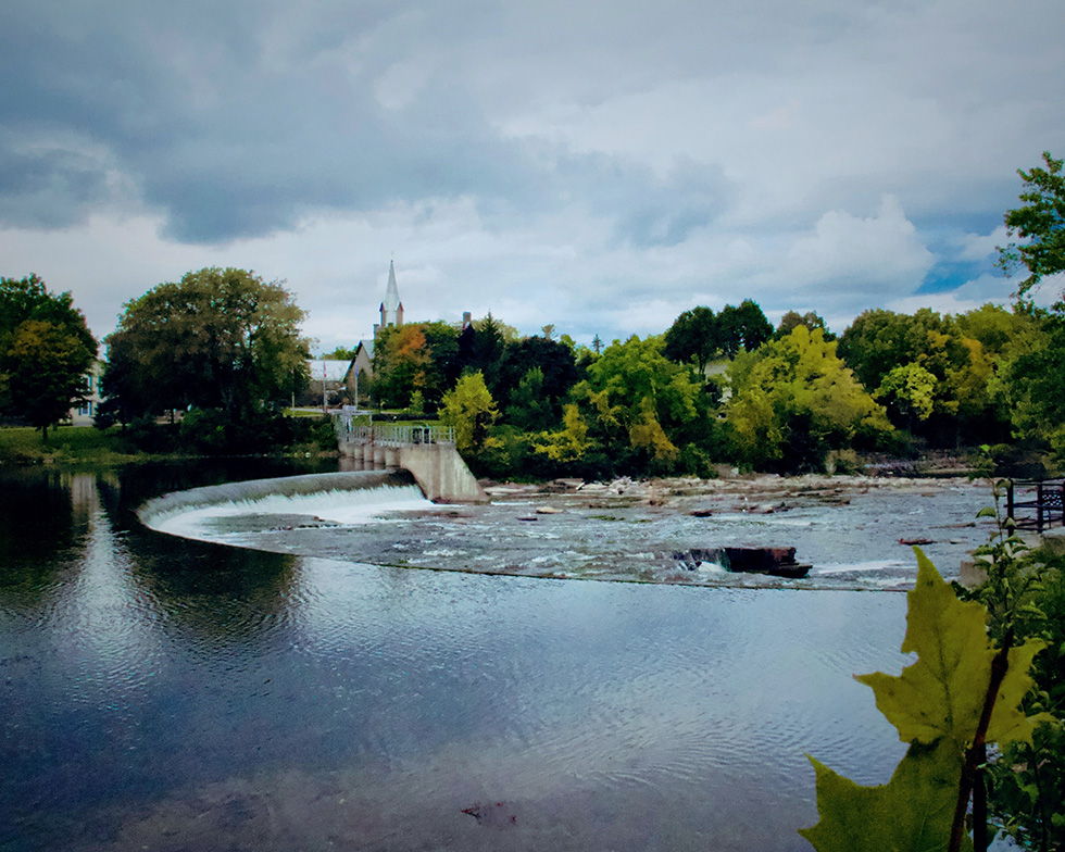
Kris' Edit
There is so much to look at in this image. I am drawn to all of the textured.
I cropped slightly and changed the aspect ration to 4:5.
I wanted the viewer to be pulled through the image to the church.
I also increased the saturation, contrast, and vibrance.
I also cooled it slightly to add some blue to the sky and water.
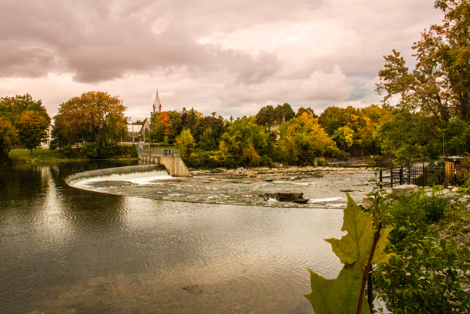
Lee's Edit
Was going for an Autumn / Fall feel
Cropped so spire of church was on the third, and cloned out the red and white buoy's.
Changed the temp to warmer
Upped the exposure, contrast, shadows, whites, clarity and Vibrance
Lower the highlights and blacks
Added a graduated filter to the sky, changing the hue, upping the temp and tint and lowing the contrast
So there you have it, the same photos all have different feels to them, so it depends what you are going for to the look that you want, a lot is possible, editing photos on a regular basis does help you get your own style.