When I first started editing photos I thought there was a right way for a photo to look. I wasn't sure what that was but I thought it was a goal that I needed to perfect. I soon found out how wrong I was. I have since learned that editing a photo is purely personal choice. All that matters is that I like it. It doesn't matter what anyone else thinks. We all edit photos differently and there really is no right or wrong. If we all edited our photos the same way it would make for a pretty boring photography world. We all have different editing styles and there are countless numbers of different programs and apps for us to use. We see that every day when we view the 365 galleries on Facebook and Instagram. Everyone's editing style is unique to them. It's interesting to see how different and creative people get with their photos.
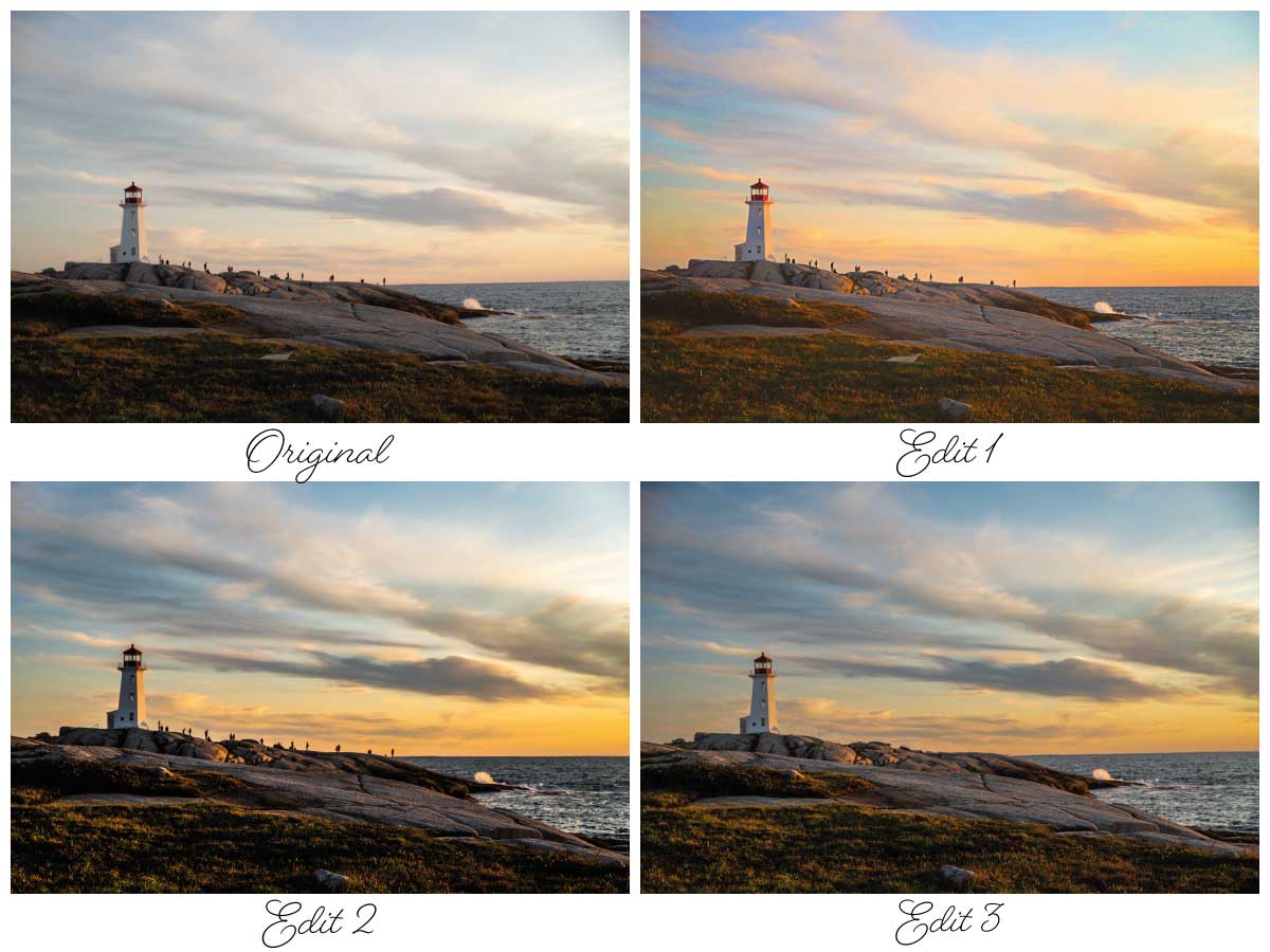
The same can be said for the creative team. We all have our unique ways of editing photos. We use different programs and we have different styles. Have you ever opened your email, looked at the photo and knew right away who's photo it was. A lot of that has to do with our unique takes on editing our photos. For this article I've decided to show you just a few takes on editing of the same photo. I took two of my photos and asked the group to edit them in their own unique styles. It's fun to see each of their takes on the same photos. How would you edit them? Is your style similar to that of a creative team member or would you go in a whole different direction?
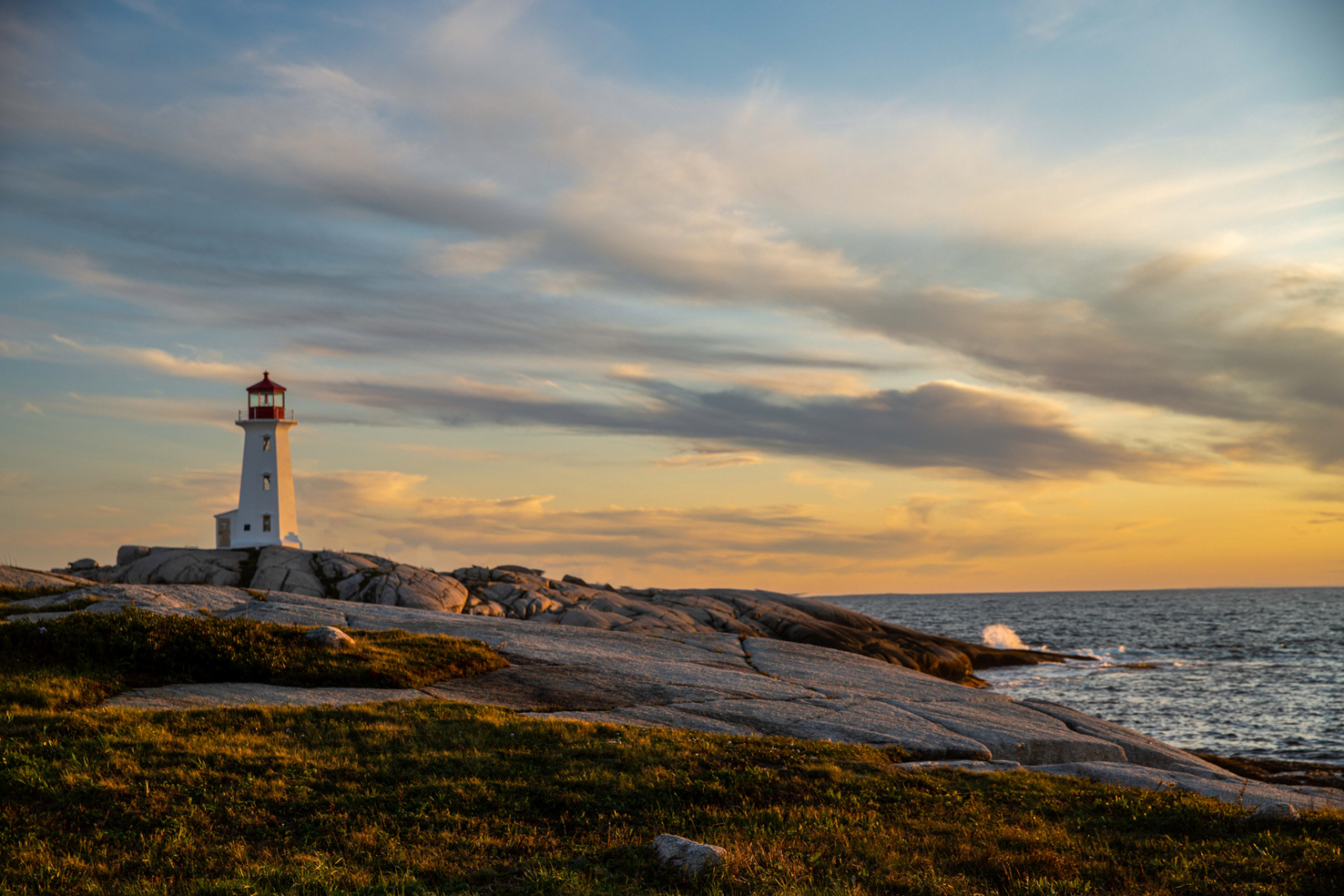
Original Photo
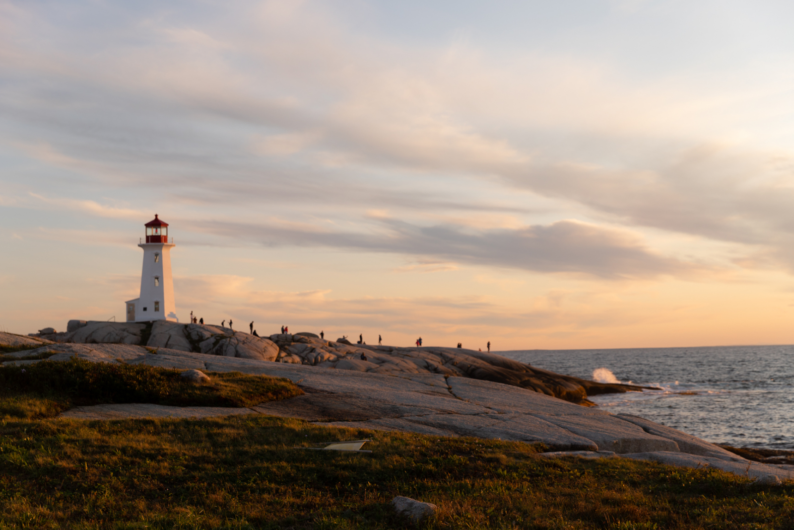
I chose two photos for the group to edit. As there are seven of us including me, I asked three to edit one photo and three to edit the second photo. The photo above is my original photo of the iconic Peggy Cove's Lighthouse. This photo was edited by Lee, Kris and Lysle and their photos are below. Let's take a look at the results shall we.The first photo below shows Lysle's edit on this photo.
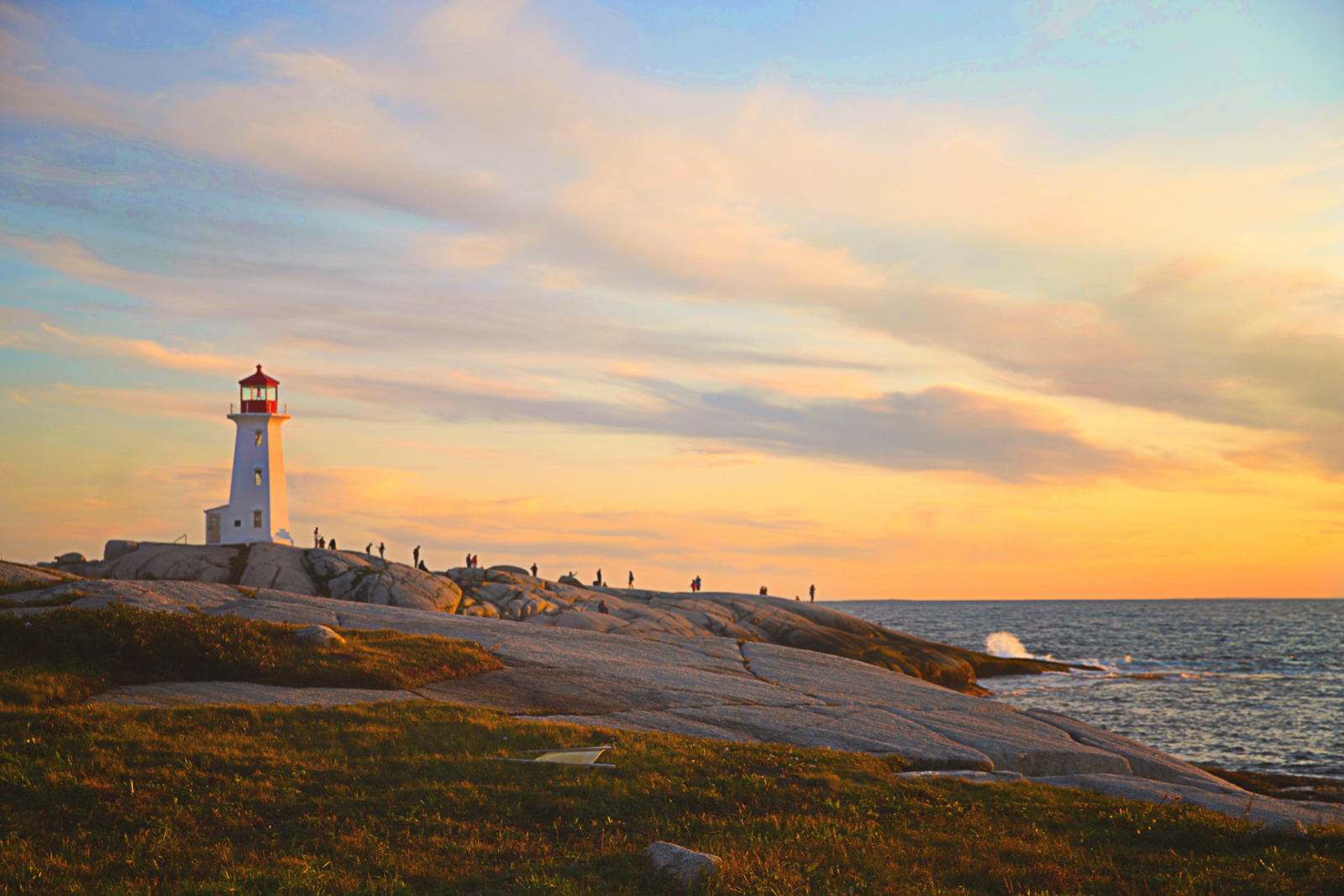
Edit 1 - Kris...
...used Photoshop when she edited this photo. Her edits are as follows:
- slight straightening of the horizon line
- slight lightening of the exposure using PS gamma correction
- warmed the image using PS color balance sliders
- increased the vibrance and saturation using PS sliders
- Added MATTE Stone Soup from Greater Than Gastby Innocence Collection (57%)
- Added Vignette from Florabelle Spring Collection (25%)
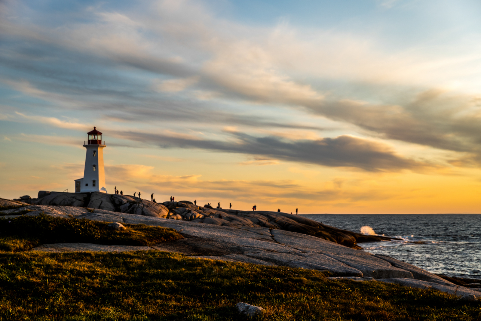
Edit 2 - Lee...
...uses Lightroom to do her editing. She describes her edits as:
I cropped and rotated the photograph slightly to put the sea on the bottom third.
My other edits included: Exposure -0.35 Contrast +53 Highlights -80 Shadows +46 Whites +50 Blacks -35 Texture -15 Clarity +50 Vibrance +7 Saturation +12
There was a board lying in the scrub at the front so I did a bit of spot removal, as I found it distracting from this lovely photo!
Edit 3 - Lysle...
...uses Lightroom to edit her photos. She described her edits as follows:
I chose to eliminate all of the people in the photo and to remove the fallen down sign in the foreground and what I think might have been step rails to the left of the lighthouse. By doing this I hoped to give a clean, fresh, uncluttered feel to the scene, as if I was the only one at the location.
My edits included reducing the exposure by -25 and increasing the contrast by +19. I then reduced the highlights to -80 as well as increased the shadows to +46. I also increased the whites to +52, added +11 to texture and +14 to the clarity. Lastly, I increased vibrance to +17 and added +9 to saturation.
Original Photo
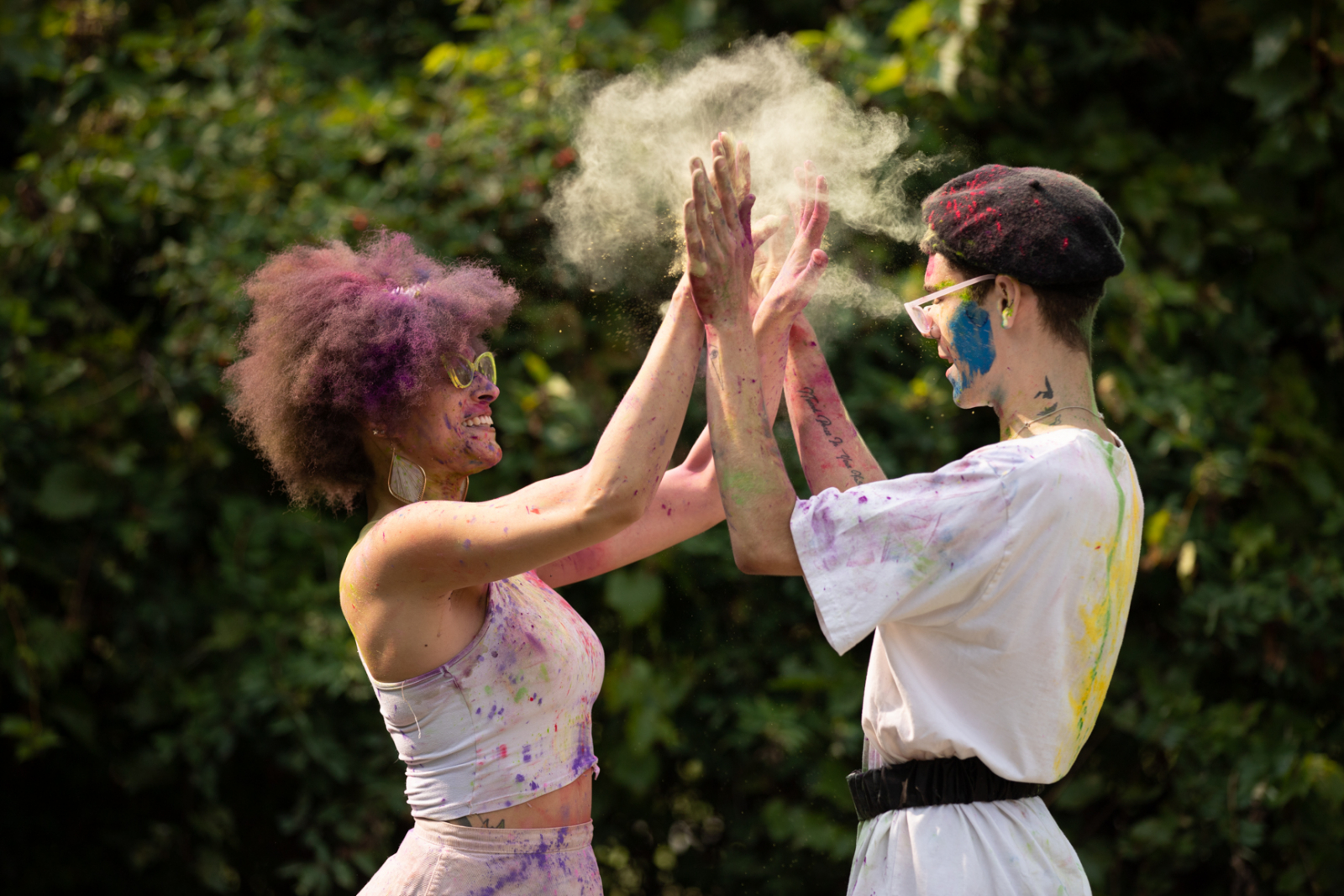
This is my second original photo. This one was edited by Amy, Joy, and Danette. Here are their takes on this photo.
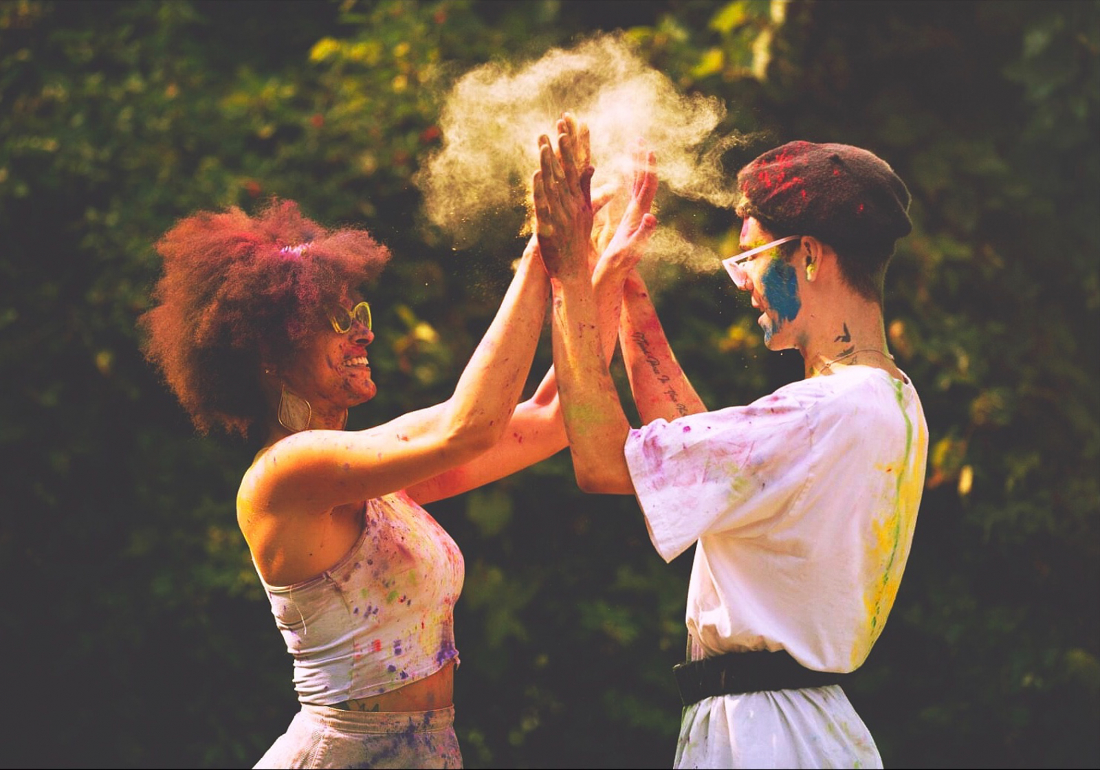
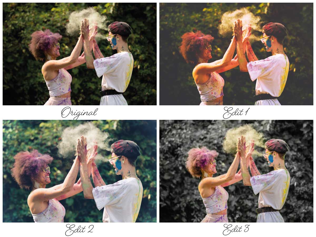
Edit 1 - Amy
The first edit above was completed by Amy. Amy used the app Mextures to do the editing. In the Mextures App she applied a Universal Formula titled Equinox and added a F-Superia Filter. She then did a slight crop to center the photo on their hand.
Edit 2 - Joy
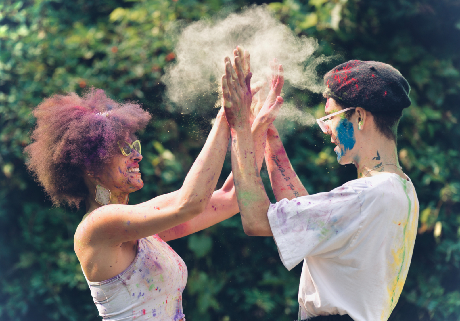
Here's Joy's comments on her edit.
I often just use the photo editor on my iPhone. It’s free and fabulous! I open up the typical Photos app and tap “Edit.” I go back and forth between liking high-contrast and washed-out looks. I went for a washed-out look for this photo just for something different. Here are the biggest elements I increased/decreased: Shadows + (I took away a lot of shadow) Contrast - (much less contrast) Black Point - (fairly large decrease - this is what really makes the faded look!) In the filters, I added Dramatic Cool, but scaled it back just a little. Lastly, I cropped it to hone in on that awesome cloud of dust and the joyful expressions!
Edit 3 - Danette
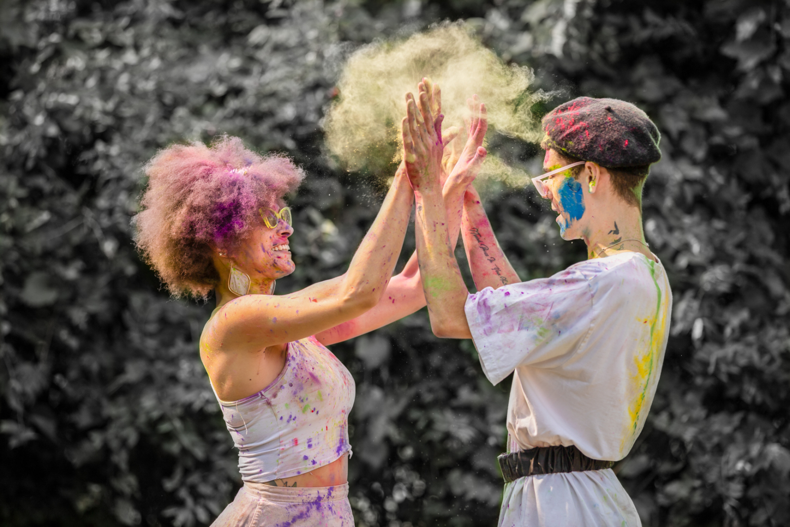
She indicates:
I used Lightroom on my iPad and here are the edits I did - Exposure +1.17 Contrast +12 Highlights -100 Shadows +56 Whites +13 Blacks -11 Vibrance +23 Saturation +2 Sharpening 34 Noise Reduction 20. Then I used a masking brush which is insanely easy to use with the iPad because I have the pencil to use with it. That allowed me to paint the mask in the desired area (I decided to pull the color out of the back ground to really make them pop). After painting my mask on, I went to the color options and pulled the saturation down -100.
Conclusion
As you can see, everyone edits the same photo in such different ways. There are such wide variety of editing programs out there to use. In this exercise 5 different apps or programs were used. Post processing of photos is such a personal choice and all that really counts is that you like the result. I love seeing the ways our 365 members process their photos. There is so much creativity in this group and your photos and your personal edits prove this on a daily basis.